
Overview
Long Tail Pro makes keyword research simple by finding the highest traffic and low competition keywords in any niche. Long Tail Pro is suitable for anyone looking to find high traffic keywords with low competition. Using Long Tail Pro anyone can save huge amounts of time, otherwise spent on keyword research and competitor analysis.


User Pain Points
Our UX team prioritized functionality and made a decision to rebuild information hierarchy. We chose to remove standard bootstrap button, hide additional functionality and leave one main CTA ― "Save Keywords".
User testing showed that users were faced with complexity in adding a new keyword algorithm.
It seemed to be hard.

We tried to find the answers to their questions and make sure that users won't have to think about them in future.
Finally, we provided the users with additional information to help them make better professional decisions. To reach that, we substituted the old summary with an info-graphic.
UI/UX Solutions
Meanwhile, our UI Designer prepared a few versions of visual appearance and we offered our client to choose the style direction:
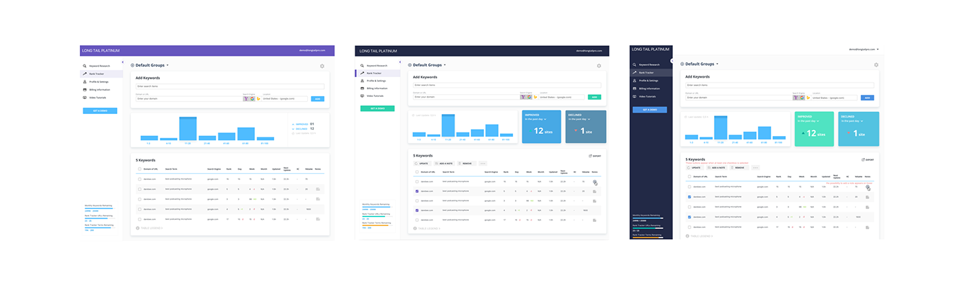
With the next iteration, we came up with a mockup that became fundamental for all the future changes and the rest of app design:

After that, we felt we could move on to the next section. The second main section provides users with a different kind of functionality, so we needed to adapt both visual appearance and the UX pattern of the “Rank Tracker” section to it.
Also, at first, the client suggested adding groups of keywords to the “Project” section in the app and we developed a few interface versions. But after some consideration and prioritizing we decided to implement this idea in a future update.
We decided to provide some changes for the “Rank Tracker” section. We tried to upgrade user info-graphic, add filters and additional functionality to the table:

With each sprint, we came closer to the desired result.
The summary section was changed multiple times, search type selection was redesigned, a simplified version of prefilters inside "Google Adwords Suggestions” and the table content, were developed.
UX designers in collaboration with a UI expert crafted a design solution:

At this stage we were faced with multiple challenges with the filter settings, as it’s not generally recommended to create a dropdown with less than 3 items. In that case it should be replaced with a radio button multiple choice. At the same time, we didn't want to decrease discoverability of all the 3 types of search the system provides; also, we needed to add settings for language and location in the way they won’t break visual hierarchy.
Finally, user research showed that people couldn’t understand the zoom icon, so we
decided to alter it and hide the prefilters.

By that time, the most of the design had been done - the main user section as well as as the other small ones. The only thing left was a nested page inside "Keyword Research" that used to look like a table, full of numbers.

After getting some extra time, as well as a very detailed instruction from the client, we started to work on a more attractive data representation of the summary and came up with the final layout:


THANK YOU!

